The Color of Magick, Part I
I never planned to write this essay. All I wanted was to sew a mojo pouch so I could petition the goddess Venus for a healthy relationship, after spending a year caught up in a twin flame fantasy that I was only able to escape from by writing a concept album.
Under the guidance of Carolyn Lovewell’s course Influence, from The Immortal College, I crafted my first piece of container magick. I filled a pouch with copper ore, rose quartz and a vial of red wine. Much to my surprise, within days, my magick was successful and I met my partner at a dance class.
But the success left me with questions. I’d picked a dusty rose pink for my pouch, but since learned the traditional association for Venus was green. Had I picked the wrong color? Where did these color associations come from anyway? To answer that, I was going to have to go deeper. Worse still, it looked like I was going to have to get over my lifelong aversion to astrology.
In this piece you can read about
- What is magick?
- What are the classical elements of magick, and what colors can we associate with them?
- Which domains might we want magick to influence?
- How does color interact with each of these domains?
- What science is involved in color and in what ways is it magically significant?
- What colors can we associate with the signs of the Zodiac?

Should you trust me? After all, I haven’t a single magick qualification to my name. However, I’m the son of an artist with an engineering degree and a stellium in Aquarius, and I’ve spent the last year researching arcane color spaces. I hope there will be something of interest here for neophytes and adepts alike.
What is Magick?
Magick is the science and art of causing change to occur in conformity with the will.
Aleister Crowley
In sympathetic magick, we manipulate objects in the world, for example by performing rituals, to bring about change beyond what we can achieve with our small individual selves. We believe this happens through synchronicities, those inexplicable coincidences that we could never have hoped to orchestrate, like a chance meeting in a coffee shop.
It’s debatable whether it’s strictly necessary, but I believe that for magick to work, we must feel an inner “that’s right” when we pick our symbols, that they must make sense to us. Since color is a higher, meta symbol, you can imagine a red, or yellow, anything, it stands to reason that it deserves particularly careful thought.
Classical elements
Throughout history, and across cultures, we have divided reality into parts, or elements. Although there are 118 elements in the periodic table that hung from the wall of your chemistry classroom, long before that there were just four: fire, water, earth and air.
Do you know their associated colors? If you do, I’d be willing to slap 20 bucks on your countertop and bet you that the associations you’ve seen are these:
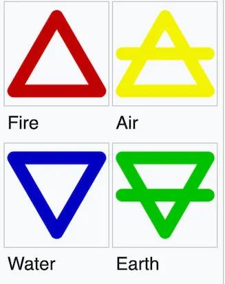
We are told to bring these colors to mind when we perform rituals like the Lesser Banishing Ritual of the Pentagram (LBRP). We refer to them in magical works, when we pick colored crystals and candles or fill our inkwells for drawing sigils.
To me, they make some sense. 75% sense, to be precise. The association that doesn’t is the one between air and yellow. Something seems off to me, but what?
What’s up with Air?
I read a theory online that air may be yellow because it’s the color left over after the other associations are made. That’s a pretty weak argument, in my book. I read elsewhere that we can associate air with yellow because of the golden glow of sunshine in the evening. In my opinion, that too doesn’t fly. That golden glow originates from the sun, and if any element should be associated with the Sun, would it not be fire? After all, what’s more fiery than a 1.4 million km flaming ball, whose temperature in degrees reaches into the millions?
The trouble then is, if fire is yellow, what happens to the remaining elements? Red certainly isn’t obviously air. And if red were earth, think red rocks, clay, then what would green be? Water? The situation is starting to seem like a sliding block puzzle.
A novel step
So, here’s my proposition. The appropriate elemental color associations are not single colors, but color ranges. Like this:
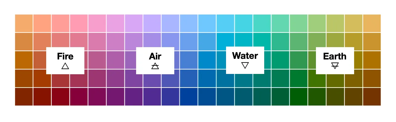
This came to me as intuition, but it’s heretical, so the burden is on me to make it make sense.
If you hate this idea, feel free to stop here.
Otherwise, I’d like to start by answering a pressing question.
Why bother?
If we’re going to spend our time wresting elements from their traditional color associations, we’d better have a damn good reason for it. And there is. Practical influence. If we use the traditional association of green to invoke Venus, but in our own, and our collective unconscious, we associate Venus with pink, the magick may lack sauce.

Spheres of Influence
There are 3 domains that I would like my magick to affect: the digital, the physical and the interpersonal.
For example, if my concern is making money, that’s a digital construct; modern money is just numbers in an online bank account. If I want a bigger place to live, that house must exist in the physical domain. I can’t live in a number, even a really big one. And if I want to experience some wild joy with friends, that’s a felt and relational phenomenon. Jokes and good times are no fun without the right company.
Each of these domains has it’s own unique relationship with color. I believe that to wield extraordinary influence takes extraordinary love and understanding. Let’s work on the understanding here; I’ll leave the love as an exercise for you, the reader.
The digital world
The digital world is new in magical history, and postdates the death of Aleister Crowley by some 40 years. It’s also increasingly becoming a major source of influence. Apparently 57% of Gen Z in America would like to be a social media influencer.
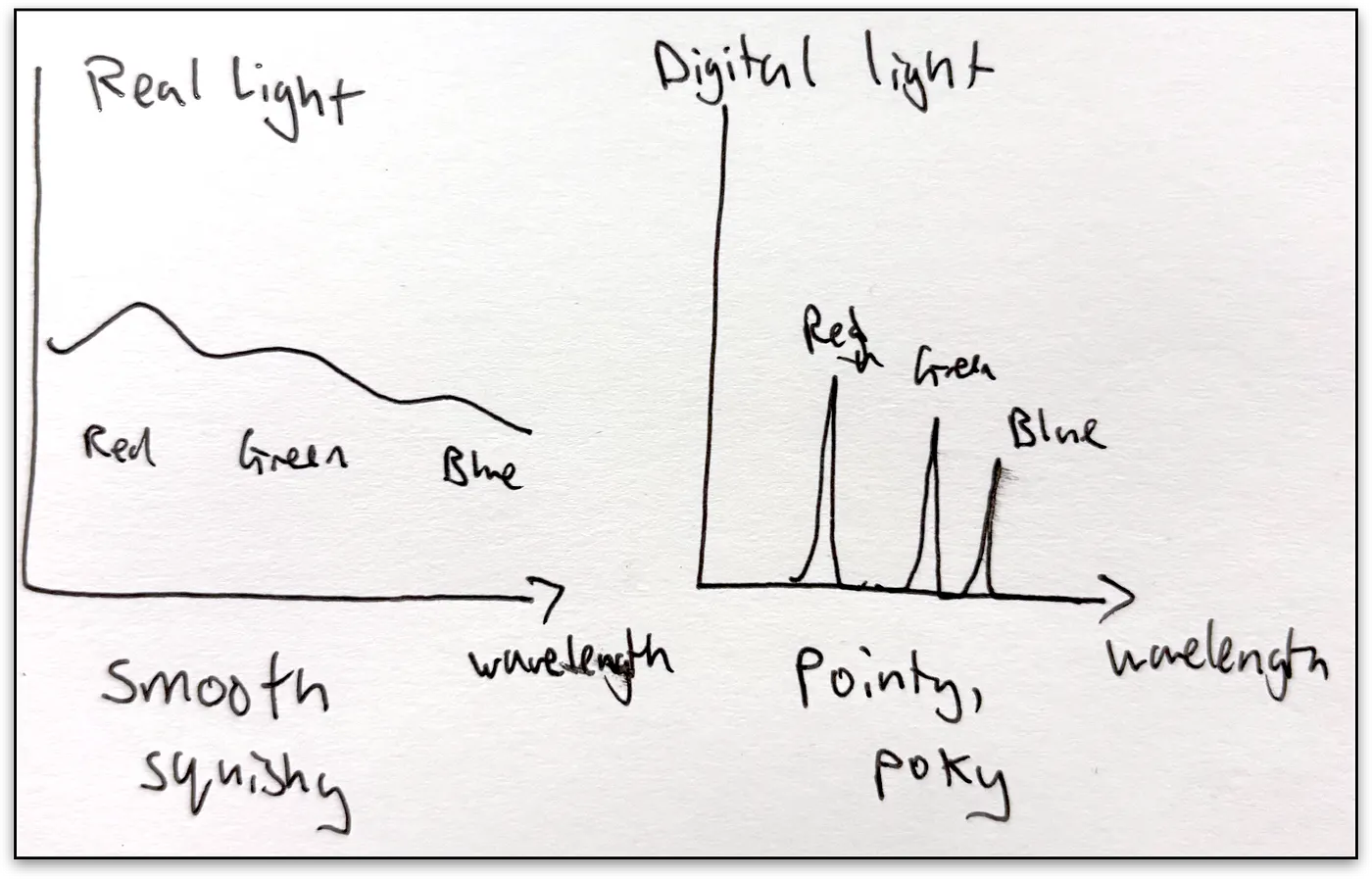
It’s worth knowing then, that when we look at a screen we see a specific representation of color. Specifically we see trichromatic, or 3 dimensional, color. This should be familiar if you’ve ever worked in graphic design, and had to pick an RGB value or hex code. A screen does not display wavelengths from the whole spectrum of visible light, just varying combinations of 3 of them. This works because most people, apart from the rare tetrachromat, only have 3 different types of color receptor. To see more wavelengths, we’d need a spectroscope, or to be a shrimp.
So our seeming ability to see different wavelengths is a mind trick. It’s done in post-production, by comparing the proportions of light at each of those receptors.
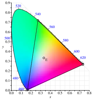
Color spaces, like the CIE color spaces shown above, map wavelengths to mixes of primary colors, producing a reference for the trichromatic colors we can display and perceive. The initial experiments were done by asking test subjects to adjust red, green and blue color values to match real colors. You can read more about the CIE on Wikipedia.
Digital style
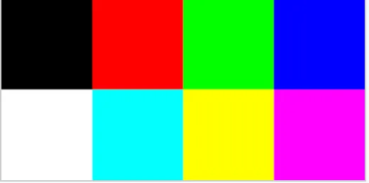
Back in the day, my first computer, the ZX Spectrum, could display a grand total of 8 colors.

These were the three pure colors: red, green and blue; their binary combinations: yellow, magenta, cyan, black, no color, and white, blue + green + red.
Digital screens today can display millions of colors, but these 8 still define the endpoints, the colors you’ll see if you max out your RGB sliders.
Digital vs real world light
Forgive me for labouring the point, but this is important. Digital light, when it’s made by combining red, green and blue, is kinda pointy. It has three sharp peaks where the colors are, and this gives us the impression of a real world color. Conversely, real world light that originates from the sun tends to be smooth, with wide contours.
To take a culinary metaphor, consider the difference between an orange flavour drink, which contains just a few ingredients: water, sugar and a flavouring, and an orange.
The real world
Just because I personally can only see 3 dimensions of color, I don’t want to be so limited when it comes to calling on higher forces, like planetary deities. I’m not saying wavelengths of light function like phone numbers for the gods, but I invite you to consider how you would contact anyone important if you were restricted to using just 3 digits.
So, since we know intellectually that other wavelengths exist perhaps we can indicate them using a wave of the hand, or as we say in engineering, an upper and lower bound.
Fire
When you heat an object, it glows. Think of a poker in the fire, glowing “red hot”. The principle that governs the resulting color is known as black body radiation.
Here’s a chart of color vs temperature for ideal bodies.
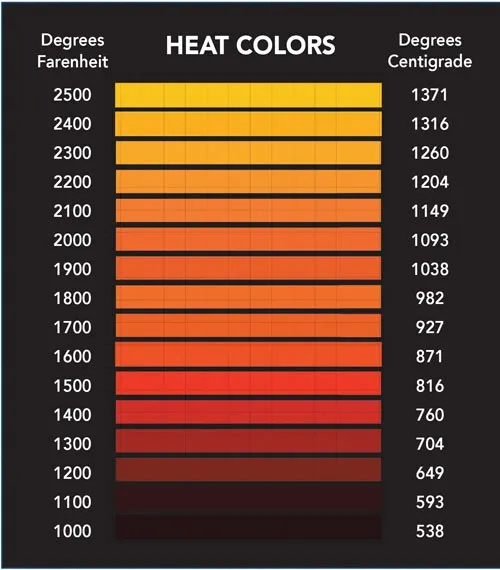
Dark red is the coolest of the hot temperatures, and as the temperature goes up the color progresses shades of orange to yellow.
It’s clear, to me at least, that red to yellow is a suitable color range for the fire element. This is our first puzzle piece.
Water
What color is water?
Most people would answer that it’s colorless. This is reasonable as that’s what it looks like when you pour yourself a glass of tap water. The most common explanation for why large bodies of water, like the sea, are blue, is because the water is reflecting the sky.
But that’s not quite the truth. We’ll get onto the sky later, but it turns out, even by itself, water isn’t colorless. Water, to sufficient depth appears cyan, the color between blue and green.

Why? Vibrations.
Specifically, water is cyan because of the modes of vibration of the Hydrogen-Oxygen bonds. The molecules act like tuning forks, absorbing the light’s energy and vibrating in different patterns called harmonics. It is, in fact, the only known natural material to get its color from vibrational transitions.
The wavelengths that water absorb most significantly are at 760nm, dark red, 660nm, bright red, 605nm, orange. So, by absorbing energy mostly from the red end of the spectrum, as a result water mostly appears green-blue.

As a student of magick, I love how fiery objects get their color from emitting light, but water gets its color from absorbing light. It adds an extra dimension to the masculine/feminine, wands/cups symbolism.
As a musician, I think it’s fucking cool that water molecules absorb light in harmonics like tiny resonant instruments, that work with light instead of sound.
And I hope you, dear reader, agree that green-blue is a powerful association for the element of water.
Air
Why is the sky blue? Hint: it’s not reflecting the water.
The answer you’ll get if you plug the question into a search engine, or your nearest physics teacher, is “Rayleigh scattering”. The sky, however, isn’t always entirely blue.

This picture shows some dusk, sunset skies. Despite being flattened into a digital color space, I see blues, corals, reds, pinks and lilacs. I used to think that such prettiness came from atmospheric pollution, but pleasingly, this is not true. It’s our friend Rayleigh with his scattering again.
It turns out scattering is responsible for more than just the blue sky, it’s behind for the whole range of colors that the sky takes.
The article I linked explains it in more detail but I’ll paraphrase it here.
- The particles in air are very small, a similar size to the wavelengths of light itself. This means that when the light passes through, it interacts with the air and gets deflected into random angles.
- The amount of scattering is inversely proportional to the fourth power of the wavelength. We’ll have to trust the physicists on this one, but essentially blue get scattered the most, and red the least.
- During the daytime, when the sun is above us, we see the wavelengths that get scattered the most, i.e. the blue sky.
- At end of the day, when the sun is low in the sky, light has had to travel much further to reach us. We see what’s left after a few thousand miles of scattering. The blue, having been scattered out, give way to the reds.
A diagram from a more detailed article illustrates it very well.
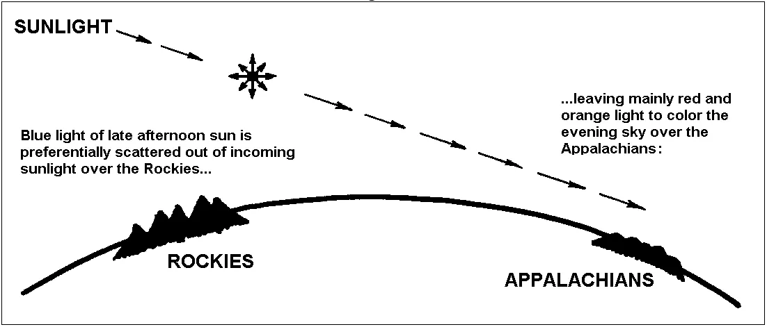
Air, by scattering, takes light and sifts it from blue to red, giving us those beautiful pink, purple, pale blue sunsets. Although because of this, the sky does sometimes appear yellow, I think the blue to red is the best association for air. What do you think?
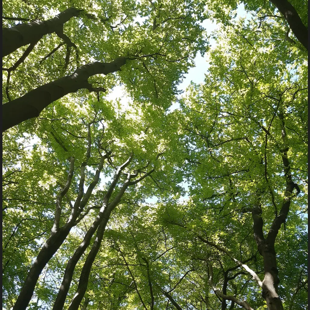
Earth
The last element in our list is earth, and the remaining color range is yellow to green.

But this is no mere afterthought. I look outside my window and I see the yellow sand. I look in my plant pots and see brown soil and green leaves. I think of tender bright green shoots of grass. I compare the green of a plant well-watered, to the sad, faded yellow of a plant left unattended. I think the association holds.
As for the science, plants are green because of one of the most important molecules on the planet: Chlorophyll. Chlrophyll absorbs red and blue light, reflecting back what’s left, green. As for why chlrophyll is so significant, Stephen Skolnick puts it better than I ever could.
Chlorophyll is the molecular antenna that makes photosynthesis possible. It’s the door through which nearly all chemical energy enters our biosphere. How many calories have you eaten in your lifetime that didn’t start out as sunlight at some point? And through that same process, spinning sugars out of thin air and sunlight, it helps produce the oxygen we breathe. – Stephen Skolnick
To me, Chlorophyll, and the green plants in which it dwells, is a perfect symbol of the earth element, embodying the point where the energy that originated from the sun takes on a material form. I hope you’ll agree that green to yellow is a solid association for the earth element.
Break time
We’ve covered a lot of ground. A new set of associations for the classical elements and their colors. And not just that, four different mechanisms of how color is formed.
- Fire — hot bodies like the sun get their color from the light they emit.
- Water — water gets its color by absorbing light and turning it into molecular vibrations.
- Air — the sky gets its color by scattering and sifting the light that passes through it.
- Earth — plants get their color by absorbing light energy and turning it into chemical energy.
Feel free to take a break to think about this, and come back when you’re ready. For bonus points, you may like to spend some time away from the screen and enjoying the glow of some real firelight. If you’re near a body of water, take a walk by it. Watch the skies of a sunset. Do some forest bathing.
Although our eyes supposedly can’t tell the difference between the colors from these sources and digital facsimiles, that doesn’t mean the differences aren’t there, and it doesn’t mean that we don’t, in some way, respond to them.
Part II continues into people, language and the zodiac.